Web design for Placement International
SEPTEMBER 2021
Who is Placement International?
Placement International is a Swiss recruitment and placement company specialized in the luxury hospitality industry with offices in Switzerland, Spain, U.S.A, and other countries around the world.
What was the task?
My first task at the company was to make a new website design proposal. No other specifications were provided except for the brand book.
Design Process
1
Identify brand's color palette and choose several colors for the website
The colors that were used for the design were Red (the main brand color), Black, and White.
The reason for choosing black and white was because Placement International worked with luxury brands and those simple colors symbolically mean elegance and sophistication.
The red color was supposed to be the one that would help guide users' attention to 'call-to-action' elements on the website.
The reason for choosing black and white was because Placement International worked with luxury brands and those simple colors symbolically mean elegance and sophistication.
The red color was supposed to be the one that would help guide users' attention to 'call-to-action' elements on the website.
2
Webpage Structure and User Flows
Before creating the final design it is important to make a wireframe of the content and website structure. Unfortunately, wireframe files were lost after I had to reboot my computer and I no longer have my user flows because they were created from corporate account on Miro.
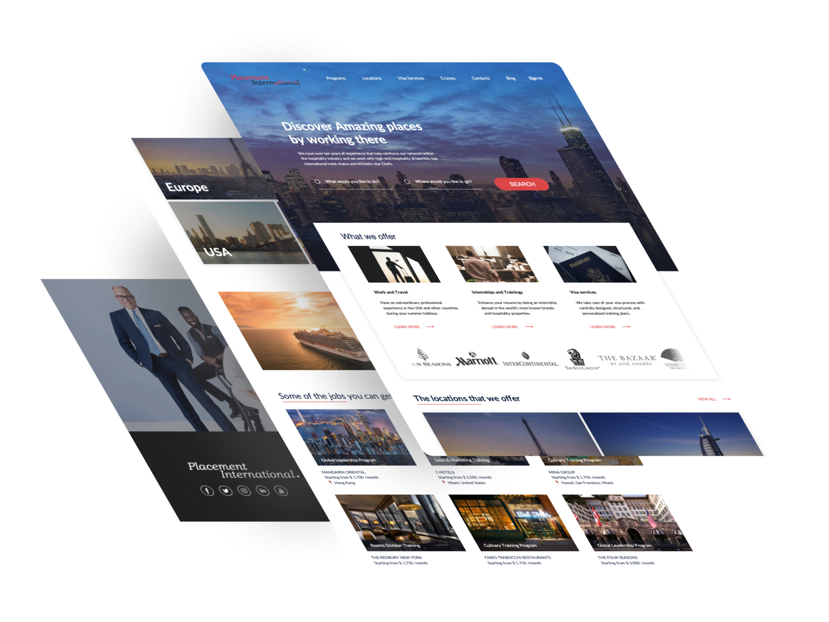
3
Styling Wireframe - Creating the design
After the wireframe was created, I started to add different images and text from their previous website. The menu options and most of the text stayed the same because marketing team asked to leave it. All other things like webpage structure and images were changed.
Website Changes
Conclusion
During creation of the website design I worked closely with the Marketing team of the company as well as the CEO. We discussed all the details of the website, which colors were the best and if everything about their company was explained in the details.
